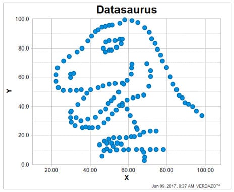
I recently read the article Same Stats, Different Graphs which spoke about Anscome’s Quartet, four highly varied datasets that are identical when examined using summary statistics, then took it to the next level with the Datasaurus Dozen by demonstrating how highly varied datasets could produce the same summary statistics.

Datasaurus Datasource: Alberta Cairo
The article states “It can be difficult to demonstrate the importance of data visualization. Some people are of the impression that charts are simply “pretty pictures”, while all of the important information can be divined through statistical analysis.” It also references Alberto Cairo who created the Datasaurus dataset to urge people to “never trust summary statistics alone; always visualize your data” because visualization can reveal valuable insights that could be otherwise missed.
This inspired me to revisit my 2015 blog How useful are IP30, IP60, IP90 … initial production measures where I illustrated how two wells with identical IP90 production performance measures had very different production profiles.
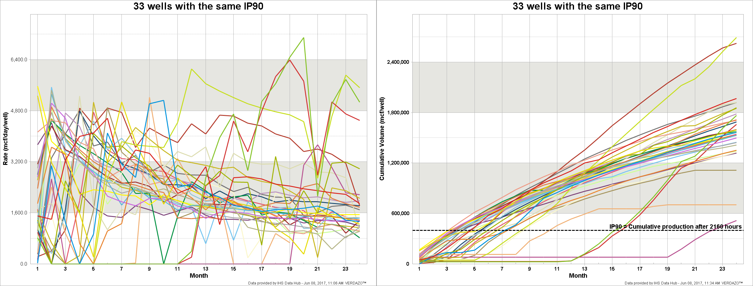
To further illustrate the dangers of using near-term production performance measures like IP90, without visualizing the production, I’ve expanded the dataset from my previous blog to show just how different the production profiles are of 33 Montney Regional Heritage wells that have the same IP90 values (i.e. IP90 values between 4400 and 4500 mcf/day). The chart on the left shows the rate vs. time profiles of each well, while the chart on the right shows the cumulative production vs. time.

IP90 is the average daily production rate after 2160 hours of production. In our sample set of 33 wells it takes from 3 to 22 months to produce for 2160 hours, and the cumulative production after 24 months ranges more than 5 fold, from 516 mmcf to 2,693 mmcf. This further demonstrates that IP90 is not a reliable indicator of longer term production. Also, the need to visualize the production profile is becoming increasingly important as rate restriction becomes a more common operational practice (look for wells without an obvious decline profile in the chart on the left).
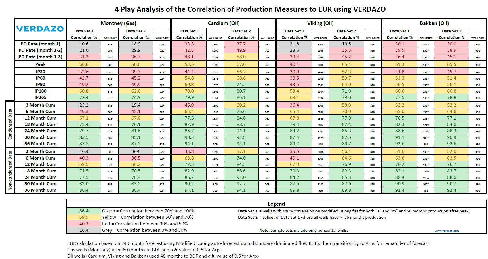
IP90 is sometimes used as a proxy for the long term production potential of a well (i.e. Estimated Ultimate Recoverable or EUR). It’s important to note that the uncertainty of any predictive measure decreases as you include more production history. The challenge is often to find the balance of including enough history to have reasonable certainty, but not requiring too much history so more recent wells are excluded from you analogue selection. The table below is useful in deciding how much history you should use to reduce the uncertainty of you production performance measure (full details of this correlation analysis can be found in my previous blog).

Conclusions:
- More data is better
- Don’t rely on summary statistics alone
- Visualize your data, from multiple perspectives, to elevate your understanding
About Bertrand Groulx
Bertrand Groulx is a well-respected oil and gas industry expert with almost 30 years of experience driving innovation and developing advanced solutions. He possesses deep knowledge and understanding of data analytics in the sector, which has allowed him to deliver unparalleled enhancements to Omnira Software's VERDAZO and MOSAIC software products. Bertrand's extensive accomplishments in the public and private sectors and his scientific publications and presentations on machine learning, visual analytics, and completion optimization have made him a thought leader. With a B.S. Honors in Geology and Geology and Geomorphology from the University of British Columbia, Bertrand focuses on enhancing Omnira Software's business intelligence and discovery analytics products in his current role, particularly the VERDAZO platform's growth and development. As a blog author, Bertrand shares his unique expertise and insights, offering valuable knowledge and guidance to industry professionals seeking to stay at the forefront of the constantly evolving oil and gas landscape.
